Saisonale Farbpaletten
Finde deine saisonale Farbpalette. Durchstöbere unsere Sammlung sorgfältig ausgewählter Farben für jede Saison und Unterseason, von warmen Herbsttönen bis zu kühlen Wintertönen.
Spring
Spring hat Farbpaletten für 3 Unterseasons: Light, True, Bright.
🌸
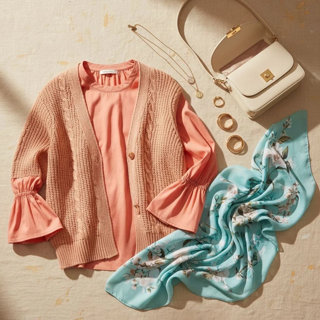
Light Spring
Light Spring is like a fresh breath on a bright morning. Its palette celebrates the gentle warmth of early spring by combining soft pastel tones with light, vibrant accents. This season embraces colors that feel airy and luminous—reflecting a natural radiance that enhances delicate features. The hues work together in a graceful interplay of softness and clarity, evoking the cheerful, rejuvenating spirit of a blossoming spring day.
Sieh dir die Light Spring Farbpalette an →
🌼
True Spring
True Spring individuals possess vivid and bright colouring. The True Spring palette is bold and dynamic, featuring clear, vibrant hues that highlight natural radiance. It bridges the brightness of True Spring with the clarity of True Winter. Unlike other Spring sub-seasons, True Spring embraces high-contrast, saturated colours that bring energy and playfulness to your wardrobe.
Sieh dir die True Spring Farbpalette an →
☀️
Bright Spring
Bright Spring individuals have bold and vibrant hues that create a lively and energetic appearance. The Bright Spring palette features high-contrast, saturated colours that bring energy and playfulness to your wardrobe.
Sieh dir die Bright Spring Farbpalette an →
Summer
Summer hat Farbpaletten für 3 Unterseasons: Light, True, Cool.
🌞
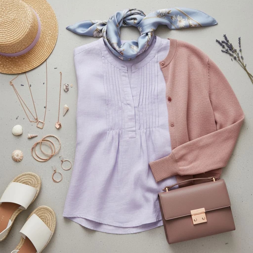
Light Summer
Light Summer individuals have soft and muted hues that create a calm and serene aura. The Light Summer palette embraces cool, pastel shades that complement the natural subtlety of Light Summer features. While it shares some similarities with Light Spring, Light Summer leans distinctly cool, emphasizing an airy and delicate look.
Sieh dir die Light Summer Farbpalette an →
🌻
True Summer
True Summer individuals blend cool and muted tones, creating a harmonious and serene appearance. Their coloring is balanced, with neither overly bright nor deeply saturated hues. The True Summer palette evokes a sense of calm and elegance, featuring shades that harmonize seamlessly with their natural features. Positioned between Soft Summer and True Summer, this sub-season perfectly balances subtlety and sophistication. Unlike its counterparts, True Summer embraces a gentle contrast, ensuring their style remains both refined and approachable.
Sieh dir die True Summer Farbpalette an →
🌤️
Cool Summer
Cool Summer individuals have cool, muted hues that create a cool and serene appearance. The Cool Summer palette features cool, muted shades that complement the natural subtlety of Cool Summer features.
Sieh dir die Cool Summer Farbpalette an →
Autumn
Autumn hat Farbpaletten für 3 Unterseasons: Soft, True, Deep.
🍁
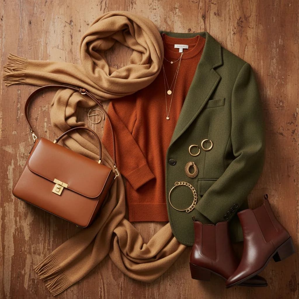
Soft Autumn
Soft Autumn individuals radiate warmth and subtlety. The Soft Autumn palette is characterised by earthy, muted tones that evoke the richness of autumn leaves.
Sieh dir die Soft Autumn Farbpalette an →
🧡
True Autumn
True Warm Autumn individuals are characterized by rich and vibrant coloring. Their palette includes deep, earthy hues that highlight their dynamic and robust appearance. The True Warm Autumn palette draws inspiration from the rich tones of a vibrant autumn forest, offering a bold and lively range of colors. Positioned as the most intense Autumn sub-season, it embraces the full warmth and depth of autumnal shades. Unlike Soft Autumn, True Warm Autumn thrives on higher color saturation and stronger contrasts, ensuring their style is both striking and effortlessly stylish.
Sieh dir die True Autumn Farbpalette an →
🍂
Deep Autumn
Deep Autumn individuals have deep, rich hues that create a bold and intense appearance. The Deep Autumn palette features deep, rich shades that complement the natural intensity of Deep Autumn features.
Sieh dir die Deep Autumn Farbpalette an →
Winter
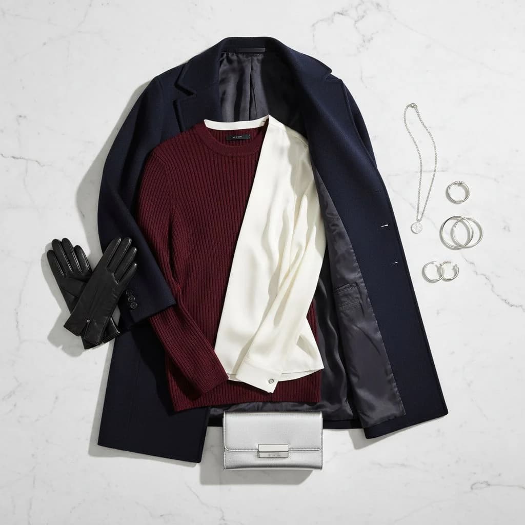
Winter hat Farbpaletten für 3 Unterseasons: Cool, True, Deep.
❄️
Cool Winter
Cool Winter individuals exude a crisp and clear presence. Their coloring is stark and contrasting, with strong, cool tones that create a dramatic and striking appearance. The Cool Winter palette is inspired by the sharp contrasts of a snowy landscape against a clear sky, offering a bold and icy range of colors. Positioned between True Winter and Deep Winter, this sub-season emphasizes clarity and intensity. Unlike Deep Winter, Cool Winter maintains a lighter edge, ensuring their style remains both impactful and refined.
Sieh dir die Cool Winter Farbpalette an →
💎
True Winter
True Winter individuals possess intense and vibrant coloring. Their palette includes bright and clear hues that complement their dynamic and vivid features. The True Winter palette is electrifying and bold, featuring high-contrast colors that make a powerful statement. Positioned as the pinnacle of Winter sub-seasons, it embraces maximum clarity and saturation. Unlike Cool Winter, True Winter thrives on even more pronounced colors, ensuring their style is both unapologetically bold and effortlessly chic.
Sieh dir die True Winter Farbpalette an →
🧊
Deep Winter
Deep Winter individuals have deep, rich hues that create a bold and intense appearance. The Deep Winter palette features deep, rich shades that complement the natural intensity of Deep Winter features. This sub-season is positioned between True Winter and Deep Winter on the seasonal flow chart.
Sieh dir die Deep Winter Farbpalette an →
Compare seasons side by side
Not sure which season fits? See detailed comparisons between any two color palettes — Bright Spring vs True Spring, Cool Winter vs Deep Winter, and more.