
Blush for cool undertones
Compare rose, mauve and berry. If a pale pink disappears or looks chalky, a richer berry applied lightly may work better than adding more layers of the pale shade.
The color counter · Free photo try-on
A rose, a peach, a little berry. Try the colors on your own face and find the flush you want.
Your photo stays in this tab. No upload to our servers. No account.
Your virtual makeup counter
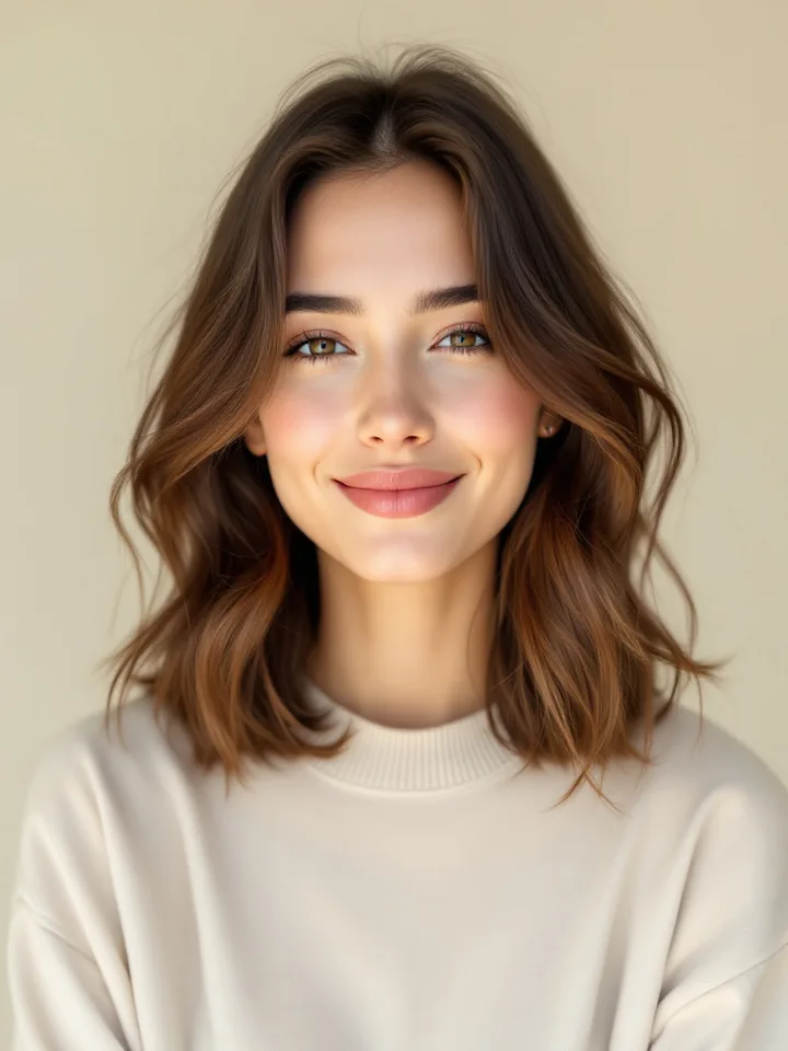
Start on our model or use a photo of yourself. Compare a soft rose, a warm peach, a richer berry.
A balanced, softly rosy flush.
A visual try-on, not an exact product or undertone match. Your lighting and any makeup already in the photo affect the preview.
Put the whole look together
Your photo comes with you when you open the combined studio.
Make the rest of your palette work together
Explore your season, clothing colors, makeup and hair recommendations in a full photo-based analysis.
Start with rose or mauve for a cool undertone, peach or coral for a warm one, and balanced rose for a neutral one. For olive skin, compare muted warm and cool options. Skin depth helps determine how much pigment will show.
Compare rose, mauve and berry. If a pale pink disappears or looks chalky, a richer berry applied lightly may work better than adding more layers of the pale shade.
Try peach, apricot and coral, then compare terracotta for a deeper look. If these pull orange on your skin, use that observation to test a more balanced rose instead.
Olive skin can be warm, cool or close to neutral. Compare muted rose with warm rose and berry in the same lighting. A green cast alone is not a reason to rule out an entire color family.
Consider pigment as well as undertone. Rich rose, berry, terracotta and plum are useful families to compare. Pale, white-heavy formulas may look ashy; a saturated shade can be blended into a soft flush.
Test one thin layer on your cheek, then step back to see your whole face. Compare in daylight with your usual base makeup. A shade that looks intense in the pan may be subtle once blended; a hand swatch is only a first impression.
These are starting points, not rules about what you are allowed to wear. The photo tool uses face landmarks to position a simulated tint. It does not diagnose your undertone or predict the finish of a particular product.
Further reading: Patrick Ta’s guide to blush and skin tone. Our shade selection is independent and does not recommend or sell a particular brand.
Use undertone to choose a starting color family, skin depth to choose visible pigment, and your preferred intensity to guide application. Compare the color families on your photo, then test the actual product on your cheek before buying when possible.
The pigment, its white or brown base, your complexion and the lighting can all change the result. Try a cooler rose if your blush looks orange, or a warmer shade with less pale base if it looks gray. A muddy result may improve with a clearer color or a lighter application.
Muted rose, soft mauve and gentle berry are useful starting points. Adjust the depth and amount to your complexion. A season label alone does not predict how a particular product formula will look.
It does not need to be the same color. A shared warm, cool or muted quality can help the two feel connected. Try a softer blush with a strong lip, then adjust based on the look you enjoy.
Yes. Try all 12 shades, adjust intensity and placement, compare favorites, and download looks for free. Your photo is processed in your browser and is not uploaded to our servers. The preview does not identify your undertone or predict an exact product match.
Choose the next tool for the question you still have.