
Lipstick for cool undertones
Explore rose, mauve and berry for everyday wear, then compare blue-red or cranberry for a stronger lip. If mauve looks gray, test a clearer rose and a different coverage before rejecting every cool shade.
The color counter · Free photo try-on
Your everyday nude. Your kind of red. See how each shade looks on your own lips before you choose.
Your photo stays in this tab. No upload to our servers. No account.
Your virtual makeup counter
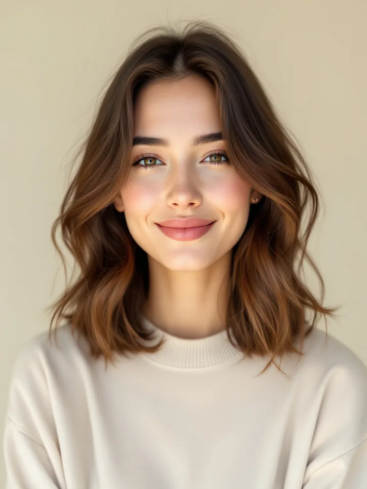
Start on our model or use a photo of yourself. Compare your everyday nude, a classic red, something bolder.
A balanced rose with a little brown.
A visual try-on, not an exact product or undertone match. Your lighting and any makeup already in the photo affect the preview.
Put the whole look together
Your photo comes with you when you open the combined studio.
Make the rest of your palette work together
Explore your season, clothing colors, makeup and hair recommendations in a full photo-based analysis.
For a starting point, compare rose and berry on cool undertones, peach-brown and brick on warm ones, and balanced rose-brown on neutral ones. Your natural lip pigment and the lipstick’s coverage matter as much as the shade in the tube.
Explore rose, mauve and berry for everyday wear, then compare blue-red or cranberry for a stronger lip. If mauve looks gray, test a clearer rose and a different coverage before rejecting every cool shade.
Compare peach-brown, cinnamon and caramel rose for everyday wear. Brick or tomato red can be useful red directions. Adjust the color’s depth to your lips rather than choosing the palest nude on the shelf.
Try muted rose-brown as a starting point, then compare cinnamon rose and mauve. Olive coloring can lean warm or cool. Notice whether a shade looks too orange or too gray, and use that comparison to refine the next choice.
Nude means close to your coloring, not necessarily beige. Rosewood, cocoa rose and brown berry can be useful directions. A coordinating liner and more opaque coverage may help when you want an even result across two-toned lips.
Compare lipstick on your lips in daylight if you can. Start with a thin layer, then check it with your whole face in view. Sheer color mixes visually with your natural lip pigment; an opaque formula covers more of it. Screens and hand swatches cannot predict the exact result.
These are starting points, not rules about what you are allowed to wear. The photo tool uses face landmarks to position a simulated tint. It does not diagnose your undertone or predict the finish of a particular product.
Further reading: Charlotte Tilbury’s guide to nude lipstick shades. Our shade selection is independent and does not recommend or sell a particular brand.
Choose a color family using your undertone, then adjust its depth and coverage to your skin and natural lip color. Decide whether you want an everyday, red or statement look. Compare the previews at different intensities to find a direction you like.
A nude can look disconnected if it is much lighter than your lips, too gray, or too opaque for the effect you want. Try a rose or brown nude closer to your natural lip depth, or apply a sheer layer with a coordinating liner.
Muted peach-brown, warm rose and soft cinnamon are useful starting points. Check the color on your own lips because natural pigment, skin depth and the product finish can change the effect.
Yes. Compare warmer brick and tomato reds with cooler cherry and berry reds. A balanced red is a useful middle ground. You can also change the intensity by blotting a full-coverage red into a stain.
All 12 lipstick colors, intensity adjustments, comparisons and downloads are free. Face landmarks place color on your lips locally in your browser. Your photo is not uploaded to our servers. It is a visual comparison, not an undertone diagnosis or an exact branded-product match.
Choose the next tool for the question you still have.