
THE AT-HOME METHOD
How to Do Color Analysis on Yourself
The full studio method — undertone, value, chroma, draping — adapted for a mirror, a window, and the clothes you already own.
Start to finish
45 min
In materials
$0
Possible seasons
12
In a hurry? Our AI analysis reads all of this from two photos in about 90 seconds — or keep reading and do it the long way.
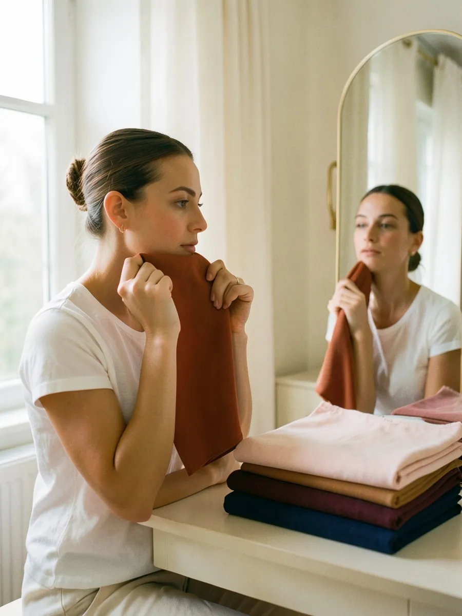
Nº 01 — The Framework
What you're actually measuring
Most guides make color analysis sound like a personality quiz. It isn't. A professional analyst is measuring three physical properties of your coloring, and every step of the at-home method exists to estimate one of them.
Undertone (hue). Whether your skin leans warm (golden, peachy) or cool (pink, blue-ish) beneath its surface color. This is not the same as how light or dark your skin is — deep skin can be cool, porcelain skin can be warm.
Value (depth). How light or dark your overall coloring reads — hair, eyes and skin taken together, the way they'd appear in a black-and-white photo.
Chroma (clarity). Whether your coloring is bright and saturated or soft and muted. High-chroma people can wear electric colors without being swallowed; low-chroma people look better in dusty, greyed-down versions of the same hues.
Your season is just the intersection of those three answers. Get the three measurements roughly right and the season falls out on its own — which is why this guide walks them in order instead of jumping straight to "are you a Summer?"
Nº 02 — Setup
Set up an honest mirror
Bad light produces bad readings — this step matters more than any test that follows. Professional studios use north-facing daylight because it's the most color-neutral light there is. You can get close for free:
- 01Sit facing a window in indirect daylight. Not direct sun, not evening light (too warm), and never overhead bathroom lighting (too yellow and casts shadows).
- 02Bare face. Foundation, bronzer and tinted moisturizer all shift your apparent undertone. Lip balm is fine.
- 03Pull your hair completely off your face. If your hair is dyed a color far from your natural one, wrap it in a white towel — dyed hair is the single biggest source of wrong self-diagnoses.
- 04Wear white or drape a white towel over your shoulders. It gives your eye a neutral reference point.
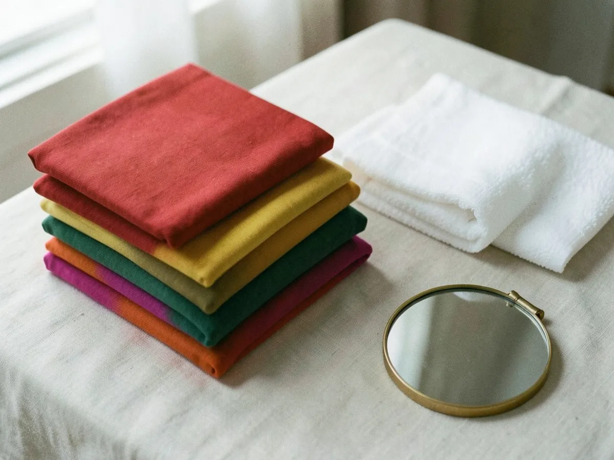
- 05Gather test fabrics: solid-colored tops, scarves, towels, bedsheets. You need warm vs. cool pairs — a tomato red and a cherry red, a mustard and a lemon, an orange and a fuchsia. Nothing patterned.
Phone cameras auto-correct color, so work in the mirror first and use photos only as a second opinion — with the color filters off.
Nº 03 — Step One
Find your undertone
Undertone is the hardest property to see directly, so you triangulate it with several imperfect tests. No single one is a verdict; you're collecting votes.
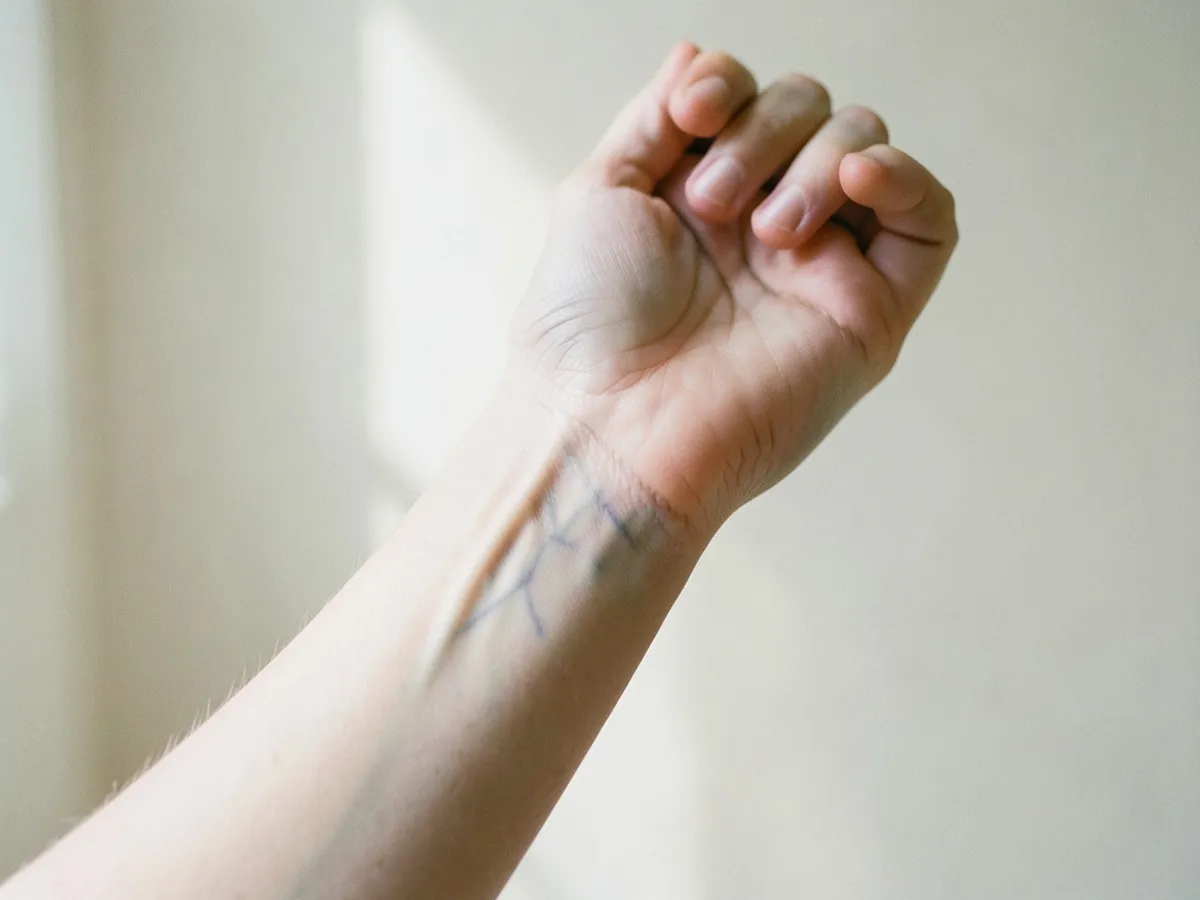
The vein test. Look at the veins on your inner wrist in daylight. Blue or purple suggests cool; green or olive suggests warm; a genuine mix of both suggests neutral. This test gets less readable the deeper your skin is — if you can't call it, skip it rather than force it.
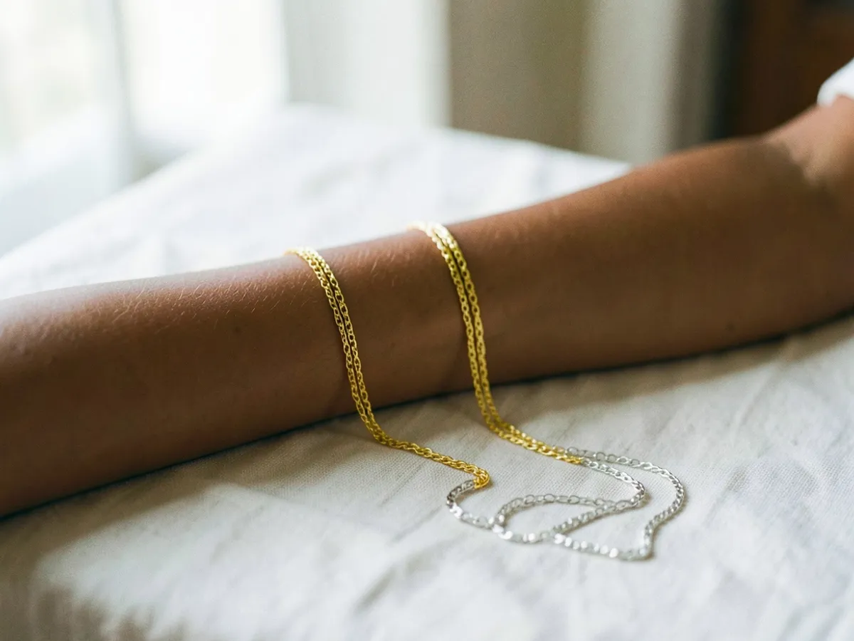
The jewelry test. Lay a gold chain and a silver chain against your bare chest or forearm. One will tend to sit "in" your skin while the other sits "on" it like a costume. Gold flattering warm, silver flattering cool. Judge the skin around the metal, not whether you like the jewelry — plenty of cool-toned people love gold.
The white test. Hold pure optic white under your chin, then soft cream. Warm undertones usually look washed out against stark white and come alive against cream; cool undertones are the reverse.
The sun test. Think about what your skin does in summer. Burn-then-tan or tan-easily leans warm or neutral; burn-and-stay-pink leans cool. (This one is weak evidence on its own — genetics interfere.)
Tally the votes. Three or four pointing the same way is a real answer. A split vote usually means you're neutral, which is common — it just means your undertone will do less of the deciding and your value and chroma will do more.
Nº 04 — Step Two
Find your value
Take a selfie in your window light and turn it black-and-white. You're asking one question: does your overall coloring read light, medium, or deep?
Look at hair, brows, eyes and skin as one unit. Pale blonde hair with light eyes and fair skin reads light. Black hair with deep brown eyes reads deep. Most people land in the middle — that's fine, "medium" is a real answer, not a failure of the test.
While the photo is still in black-and-white, note one more thing: the gap between your darkest feature and your lightest. Big gap (dark hair, fair skin) means high contrast; small gap means low contrast. High-contrast coloring handles bold color-blocking and stark combinations; low-contrast coloring looks best when colors stay close in depth. Keep this number in your pocket — it settles ties later.

Nº 05 — Step Three
Find your chroma
Chroma is easiest to see in your eyes. In daylight, are they bright and glassy with sharply defined color, or soft, smoky, greyed-at-the-edges? Bright eyes usually mean bright coloring; muted eyes usually mean muted coloring.
Then confirm with fabric: hold up the most saturated thing you own — a true bright, like cobalt or hot pink — and then something dusty, like sage or mauve. If the bright makes your face pop and the dusty one makes you look faintly tired, you're high-chroma. If the bright wears you — if you notice the shirt before the face — you're muted.
This is the property people most often get wrong about themselves, because we confuse what we like with what works. The mirror doesn't care what's in your wardrobe.
Nº 06 — Step Four
Drape — the test that actually decides
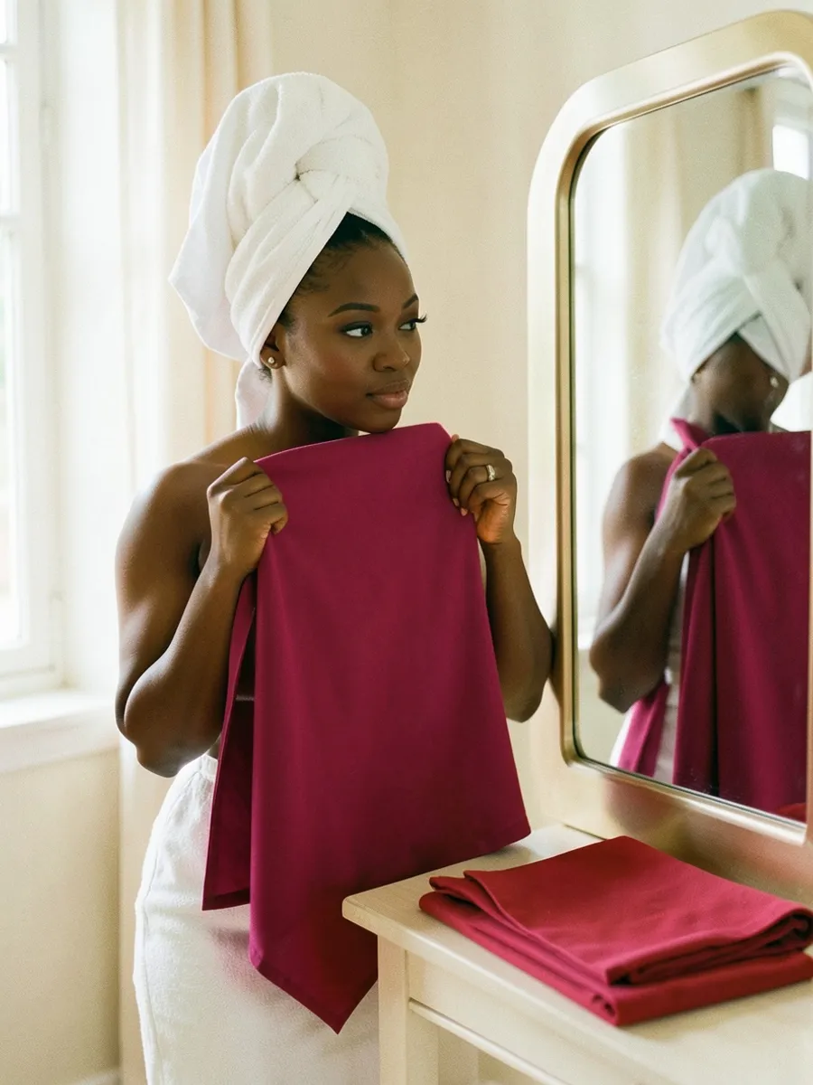
Everything so far was estimation. Draping is measurement. One color at a time, hold each test fabric under your chin, look at your face — not the fabric — and give it three seconds.
A right color does quiet, specific things: skin looks more even, dark circles fade, jawline looks a touch sharper, eyes brighter, teeth whiter. A wrong color casts shadows around the mouth and chin, pulls out redness or sallowness, and makes you notice the fabric instead of the person.
Work in warm/cool pairs so you're always comparing, never judging one color in a vacuum: tomato red against cherry red, mustard against lemon, olive against emerald, orange against fuchsia. Whichever half of each pair wins is a vote for warm or cool — this either confirms your Step One answer or overrules it. Trust the drape over the wrist veins every time.
Two honest warnings. First, you will be biased toward colors you already wear; asking someone blunt to watch is worth more than an hour alone. Second, if every color seems to look "fine," your light is too flat or too warm — fix the light before you conclude you're a unicorn.
Draping is exactly what our AI does — it compares dozens of digital drapes against your photo and scores the reaction, without the bias.
Nº 07 — Your Season
Put the three answers together
You now hold three measurements: undertone, value, chroma. The 12-season system is just every useful combination of those, grouped into four families. Find your row:
| Your results | Season family | The three variants |
|---|---|---|
| Warm + light-to-medium + bright | Spring | Light, True, Bright Spring |
| Cool + light-to-medium + muted | Summer | Light, True, Soft Summer |
| Warm + medium-to-deep + muted | Autumn | Soft, True, Deep Autumn |
| Cool + medium-to-deep + bright | Winter | True, Bright, Deep Winter |
Then let your strongest characteristic pick the variant. If the most obvious thing about you is how light you are, you're a Light Spring or Light Summer. If it's how muted you are, Soft Summer or Soft Autumn. If it's depth, the Deep seasons; if it's brightness, the Brights. Neutral undertones almost always land in one of the Soft or muted seasons, where undertone matters least.
If you're stuck between two, they're almost certainly sister seasons sharing two of the three properties — Soft Summer and Soft Autumn, say, split only by undertone. Re-drape the pairs that separate them and let your face break the tie. Our season comparison tool shows any two palettes side by side.
See every palette laid out in the 12 season color chart.
Nº 08 — Where It Goes Wrong
The five classic mistakes
After watching a lot of people do this badly, the failure modes are surprisingly consistent. Testing in warm evening light or bathroom light — every reading skews warm, and half the internet's self-diagnosed Autumns are actually Summers with yellow bulbs. Analyzing around dyed hair instead of wrapping it. Judging the fabric instead of the face — "I love this green" is wardrobe data, not coloring data. Confusing value with undertone — assuming deep skin must be warm or fair skin must be cool, when the two axes are independent. And quitting at the family level: "I'm an Autumn" is a start, but the money is in the variant, because a Soft Autumn in True Autumn colors still looks slightly off.
One more that deserves its own line: doing all of this once, in one session, tired, and treating the result as gospel. Professionals drape twice. Sleep on it, redo Step Four on another day, and only trust results that repeat.
Nº 09 — FAQ
Questions people actually ask
THE SHORTCUT
Or let the software squint for you
Everything on this page — undertone, value, chroma, draping — is what our AI measures from two photos. You get your exact 12-season result, your palette, and the colors to avoid, in about 90 seconds.
Prefer a quiz? Start with the free color analysis quiz.
Free · Straight to your inbox
Want the printable version?
Get this guide plus a season-by-season palette cheat sheet in your inbox.