
Neutral Brown
The middle reference. Start here if strong gold looks too orange but very ashy colors look flat.
Try this shade on my photo →Olive skin · a practical color comparison
Start with three browns, not a rule that olive skin must be warm. Compare neutral, golden and ashy directions at a similar depth, then explore how light or dark you want to go.
Use Neutral Brown as a reference. Compare Chestnut Brown for more golden-red warmth and Ash Brown for a cooler, muted effect. Keep your photo, makeup and screen brightness the same. This is a way to explore preference, not a test that assigns an undertone.
The middle reference. Start here if strong gold looks too orange but very ashy colors look flat.
Try this shade on my photo →The warm comparison. Look for a level of red-gold reflect you enjoy, rather than assuming more warmth is better.
Try this shade on my photo →The cool comparison. Notice whether the smoky tone gives the softness you want or whether you prefer a clearer brown.
Try this shade on my photo →Compare chestnut, caramel brunette and a softer golden brown. A warm direction can be subtle: you do not need to choose bright copper to see warmth. If the preview looks orange, compare a more neutral shade before changing the depth.
See the warm-undertone shortlist →Compare ash brown, mushroom brown and cool espresso. Keep one neutral option in your shortlist so you can judge whether a very smoky or very dark shade adds more contrast than you wanted.
See the cool-undertone shortlist →A light olive complexion can prefer a deep brunette; a deeper olive complexion can prefer blonde. Instead of matching hair depth to skin depth, compare the amount of contrast around your face. Eye color, brows, your natural base and the look you enjoy all matter.
To explore blonde, compare muted beige with a warmer honey and a cooler mushroom direction. These previews show color ideas, not how much lightening your hair would need.
A balanced beige direction. Compare how its lighter depth changes the contrast with your brows.
Try this shade on my photo →The warmer blonde comparison. Notice the golden reflect as well as the change in lightness.
Try this shade on my photo →The cooler, muted blonde comparison. Try a neutral option too if this appears too gray.
Try this shade on my photo →Compare a less golden or red shade at a similar depth. Check that warm indoor lighting is not changing the whole photo.
Try a more neutral or clearer color before going darker. A muted preview and a dark preview can both feel flat for different reasons.
Compare a shade closer to your natural depth. If you still want a dramatic change, save both options and discuss placement or highlights with your colorist.
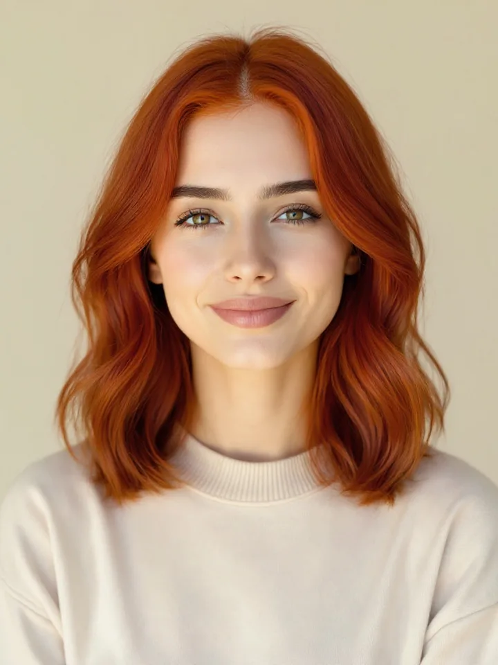
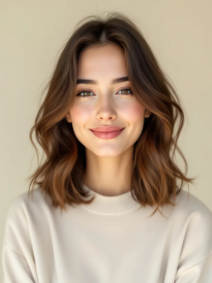
Drag to compare · Copper Red
AI-generated examples on a model. A preview helps compare colors; it cannot predict a dye formula or salon result.
Try this shade on my photo →Switch the example shades and drag the divider. The model demonstrates the preview tool; we are not labeling her complexion as olive.
For a useful personal comparison, choose a front-facing photo in even daylight, with your hair visible and without a strong color filter. Try your three selected shades on that same photo and save the results you want to discuss.
A stylist can help assess your current color and explain the maintenance or process. Our preview cannot predict a dye formula, hair condition or an exact salon result.
Olive skin can make a familiar lipstick or blush look different beside a new hair color. Compare olive-skin lipstick directions and olive-skin blush directions, then use the Look Studio to view a complete combination on one photo.
There is no single shade for every olive complexion. Compare neutral brown with a warmer chestnut and a cooler ash brown first. Then adjust depth and saturation to the contrast and look you prefer.
Yes. Olive coloring can lean warm, cool or neutral. Do not use a green cast alone to choose a warm hair color; compare warm and cool options at a similar depth.
Yes. Compare muted beige or mushroom blonde with a warmer honey direction. A preview helps you explore the color relationship; a colorist can explain what your current base would require to achieve it.
The combination of muted pigment, depth, lighting and the colors around your face can create that impression. Compare a neutral brown at a similar depth before deciding that all cool colors are wrong for you.
No. These are names from our virtual preview catalog and illustrative screen swatches. They are not dye formulas or exact matches to a particular brand.